Analog to Digital Transformation
RESEARCH / TESTING / DIGITALIZATION / UIUX
The Challenge
Our client was a corporation that designs and manufactures dispensing equipment for consumer and industrial adhesives, sealants and coatings. They tasked us with designing an already existing manual interface into a digital interface and restructuring the system in a more usable and intuitive way.
How can we best translate the manual interface into a digital product while maintaining and increasing the level of familiarity and comfort of use for both new and existing users?
Design Approach
It was important to us that we understood the relationship between the manual interface and its users; we observed users interacting with the interface at real client sites. Taking these findings, we took the time to reprioritize and reorder the information architecture, then ideated a few contrasting design prototypes. We then took these prototypes to real client sites and tested them in random order using the Comparative Usability Testing method. The successful parts of each prototype were combined to create a final design.
Role
UX Designer, UX Researcher
Duration
9 Months
*Please note that this project is under a non-disclosure agreement. Some details may be vague to protect the client’s intellectual property.
01 Familiarizing Ourselves with the Manual Interface
We prioritized learning and understanding the existing product by reading the operators manual, watching videos, and asking our client any questions we had. Additionally, a big focus of our conversations revolved around the relationship between the device and operators, as well as the environment and context of the device.
02 Research / Visiting and Observing Real Users
We visited a total of three sites in Ohio and were able to observe real users interacting with the current manual device and ask them questions regarding their experience.
Findings:
It’s difficult for users to access any functions or information beyond the basic functions due to the limitations of a manual device and the limited time between sprays.
It’s evident that many users don’t know how to use the manual device—some are even intimidated that adjusting their settings will make things worse, and therefore avoid the device entirely.
Depending on their role, the purpose of the device could differ. While operators are adjusting their spray settings supervisors need to be able to monitor the settings of the different guns being used.
03 Remapping the System Information Architecture
Numerous workshop sessions were spent with the client, referencing the operators manual and categorizing each function. We took time to group similar functions and determine where in the digital system it would be most intuitive for the user to find. Once all of the functions were categorized, we created a new information architecture map of the entire system within Miro.
This information map was used as a guide when designing the individual screens for the digital device.
04 Building a Figma Component Library
I was tasked with creating a component library within Figma for this project which would also be used as the client’s style guide in the future.
While some components were compiled from other existing digital products, any new icons and components were created following the client’s style guide.
*Only one size and color of each component type is shown.
05 Initial Designs
Home Screen
When designing the home screen, we explored how we could display the different types of required information, playing around with the order of information and the orientation of the screen.
The goal of this new home screen was to make interacting with the interface more intuitive and easy to understand for operators. Different combinations and usage of text, labels and icons were also considered and compared to achieve this while designing.
Additional Screens
Settings, maintenance, activity log and gun diagnostics are additional sections outside the home screen. Design time was primarily spent ordering the different functions in their respective sections and defining the type of component they should be.
06 Designing Three Contrasting Home Screens
Prototype 1
This prototype focused on a vertical layout without particularly adding or taking away from what was the original manual interface. Similarly to the original device, users can tap or hold the up and down arrows to adjust in increments of one or five.
Prototype 2
We explored a horizontal concept with the different spray guns being exposed as opposed to being hidden in a dropdown. We also added a dial to mimic the original wheel.
Prototype 3
The third prototype addressed the issue of many operators not understanding what the control values on the device mean. We provided animations that show operators how the changes in value affect the powder.
07 Prototype Testing on Real Users
We visited five sites and tested a total of 22 real users. We showed users the prototypes in random order using the Comparative Usability Testing method, encouraging them to take the time to familiarize themselves with each interface and share their initial thoughts and questions aloud; below are a handful of quotes that we gathered while testing.
We found that each of the prototypes had areas that work well and were favored by the operators but also areas that triggered confusion and intimidation in interacting with the device. Due to strong favors and disfavors found in each of the prototypes, we decided to move in the direction of combining the favorable parts of each prototype into one final design.
08 Final Designs
Home Screen
Hamburger Menu
Gun Settings & Diagnostics
Maintenance
Recipes
Settings
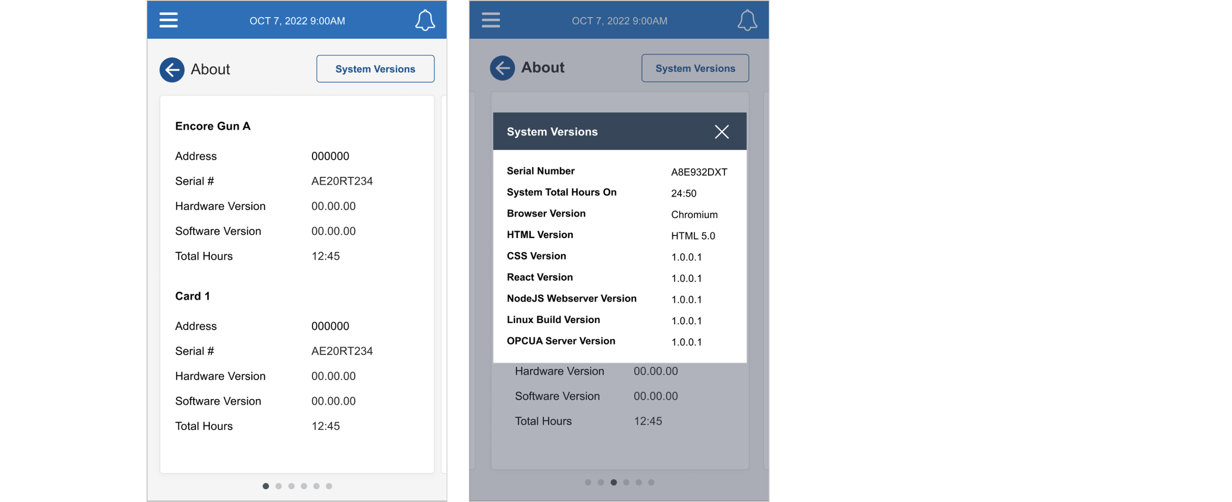
Settings: About
Settings: Controller
Settings: Network
Settings: Users


